
Responsive website design
Plan page structure and intuitive website navigation.
We design and develop responsive websites with clear navigation, accessible layouts and SEO-friendly foundations that make it easier for visitors to act.

Review your site goals, audience, content needs and current user experience.
Learn more about Impression Max →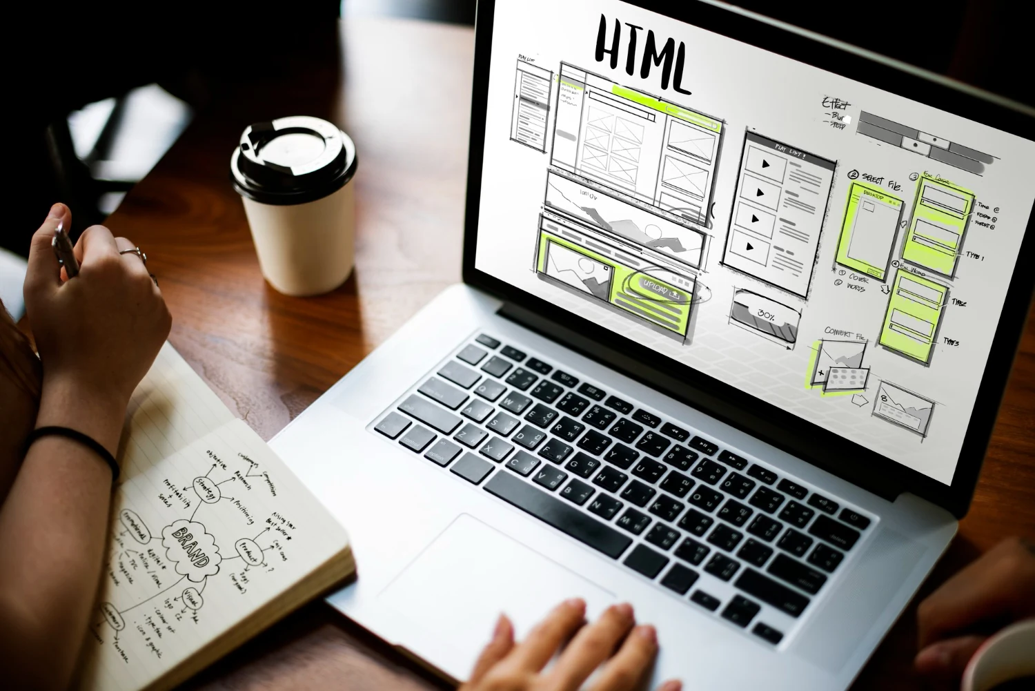
The right solution depends on what you already have, where your customers are and what you want to achieve next. Here's where we can help.
Plan page structure and intuitive website navigation.
Design responsive layouts for mobile, tablet and desktop.
Build service pages with clear content and calls to action.
Consider performance and technical SEO during development.
Connect contact forms and essential website functions.
Check core site functionality and usability before launch.
We start with context, not assumptions.
We turn what we learn into actionable priorities.
We put the work into motion, then test and refine.
We use insights to decide what matters next.
Yes. Mobile responsiveness is part of the design and testing process.
Yes. We can review your current site and plan improvements to layout, content, performance and usability.
Your marketing channels work better when they support one another. Explore related services to find the right combination.
Tell us what you're working toward. We'll start with a straightforward conversation.